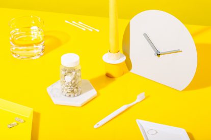

In the past, herbal pills came in flowery or bland packaging that used green or brown as a signifier of safety, emphasising ‘calm, benevolent nature’ almost to the point of being boring. Now bright colours, jovial language, and happy graphics are injecting life into the natural supplements category. Beyond just the world of nature, newer brands adopt the design language of tech, the visual information language of apps, and the colour palette of clean eating to entice a more youthful audience.
These brands have captured and capitalised on a key cultural shift: young people are ever more concerned with both longer term health goals and making themselves ‘better than well’ in the here and now. These people aren’t exclusively yogis or vegans or those with low immune systems, but are regular millennials who are making connections between their health today and their body and wellbeing in the future. They seek not to fix a medical problem, but to optimise their lives by making themselves even “better than healthy” – faster, stronger, more alert, more intelligent, and more resilient. The standard nature-conscious and basic medical language of the existing category is unlikely to appeal to this generation used to intuitive tracking apps, minimalist lifestyles, mindfulness, clean living and personalisation. If the industry wanted to grow and get younger generations excited about spirulina and magnesium, a radical change was needed from the outset.
Companies such as Ritual and Vitl have embraced intuitive cues from the latest technology brands and products and the clean eating movement. They’ve moved away from the uninspiring imagery of flowers and green-brown colour schemes to cleaner graphic designs, sans serif types, bold brand statements, colour blocking, even incorporating cute or kitsch colour schemes.
– Becks Collins
Image credit: Ritual