Purple is Ocado’s New Green
How Space Doctors impacted the design work behind the 2021 Ocado brand refresh
Ocado has established itself to be synonymous with an incredible range of quality groceries. But their visual identity risked losing its zing and zest over time and was in need of a refresh. We worked with the Ocado team to set a new course for their visual design, towards something distinct, vibrant and long-lasting.
Digital spaces demand more of a brand’s visual identity. It was vital that Ocado was able to come alive brilliantly here, and for every customer interaction to be meaningful and well received. Space Doctors delved into culture – using semiotics and cultural insight – to discover how Ocado’s visual world could evolve to become more potent.
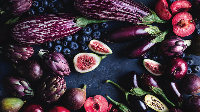
Our analysis explored Ocado’s colours. Their previous green and charcoal colour scheme felt too serious – it risked seeming impersonal or lacking in emotion. These muted colours had a quiet subtlety that felt at odds with the vitality and variety of choice Ocado is known for. More energy was needed. We sought a new way that not only evoked a fresh new vibrancy, but that was ownable for Ocado.

We knew shape and form would also be vital to evoke a sense of dynamism and opportunity. The brand’s organic shapes were strong, but as people view the world on ever tinier screens, they needed to work harder to be distinct. We considered how the Ocado swirl and wordmark could be tweaked to stand out and be even more clearly recognisable.
The resulting redesign shows Ocado having evolved. It feels emergent, bright, fresh and distinct – and robust enough to remain so into the future.
Lisa McDowell, Head of Brand Marketing at Ocado Retail, said of working with us;
“We love working with Space Doctors at Ocado Retail. Their contribution across multiple projects has been invaluable over the last year. Our teams across Marketing, Merchandising, Insights and Creative value the rich and wide ranging culturally-informed category insight, through to the granular analysis we’ve done on our visual and packaging identity, fleet design and value messaging. Our relationship with the team at Space Doctors has helped us stretch our thinking, shape successful creative briefs and carve out new exciting opportunities.”
If you’d like to chat to us about how we can help you reinvigorate your visual identity, please get in touch.
For more like this straight to your inbox, sign up to our newsletter.
Image Credit: Courtesy of Ocado