Case Study
Ocado
Building distinction for a digital-first grocery experience

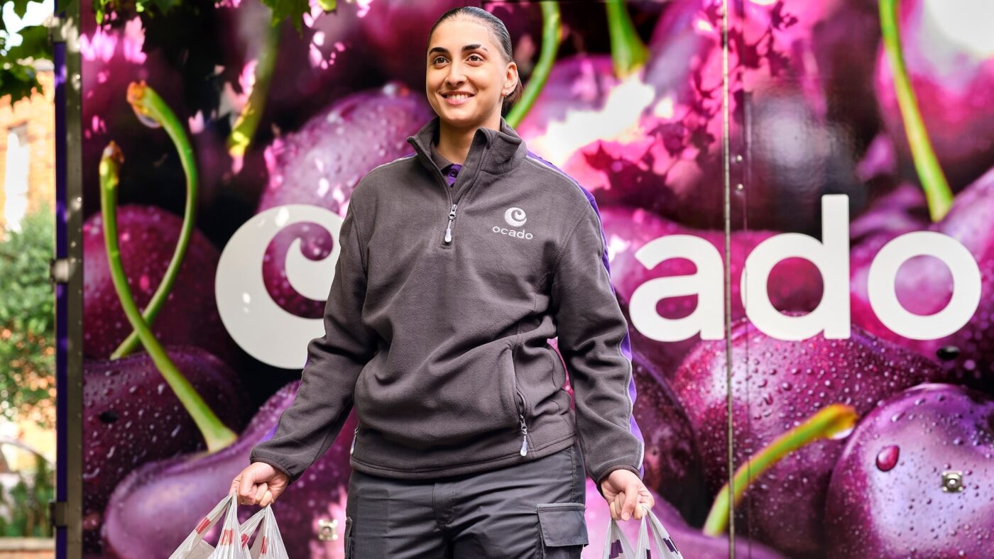
Image courtesy of Ocado
The Challenge
To evolve Ocado’s identity to build vibrancy and show up distinctly in a digital environment.
Approach
Analysing visual codes in digital retail to understand how colour, shape, and form could be optimized for maximum impact on digital platforms, especially on smaller screens.
Creating meaningful moments in every interaction.

The Cultural Unlock
A colour refresh. Ocado’s existing green and charcoal palette masked the brand’s true personality and wasn’t distinctive in the grocery landscape. Purple showcased Ocado’s innovative, inspiring spirit more potently.
Impact
01
A comprehensive visual refresh that transformed Ocado’s brand expression across touchpoints: online, packaging design, across the delivery fleet and uniform design.
02
Contributing to retail revenue growth of 4.1% in 2021.
03
The shift to purple as a primary brand colour was more than just aesthetic — it represented a bold move away from category conventions and positioned Ocado as a distinctive player.

“Space Doctors’ contribution has been invaluable. Our teams across Marketing, Merchandising, Insights, and Creative value the rich and wide ranging culturally-informed category insight. Our relationship with the team at Space Doctors has helped us stretch our thinking, shape successful creative briefs, and carve out new exciting opportunities.”
Coty / adidas:
Creating the future of fragrance

